Dom’s Kitchen and Market
I came into this project after the first team had to go back to the drawing board completely. Account did not like the work. I took over as writer and led concepting, in 2 days produced 30 pieces of social content. It got full approval from account. Then full approval from client, the only change was to not use a word (“perks”) a competitor used. That’s it, in 30 pieces of content.
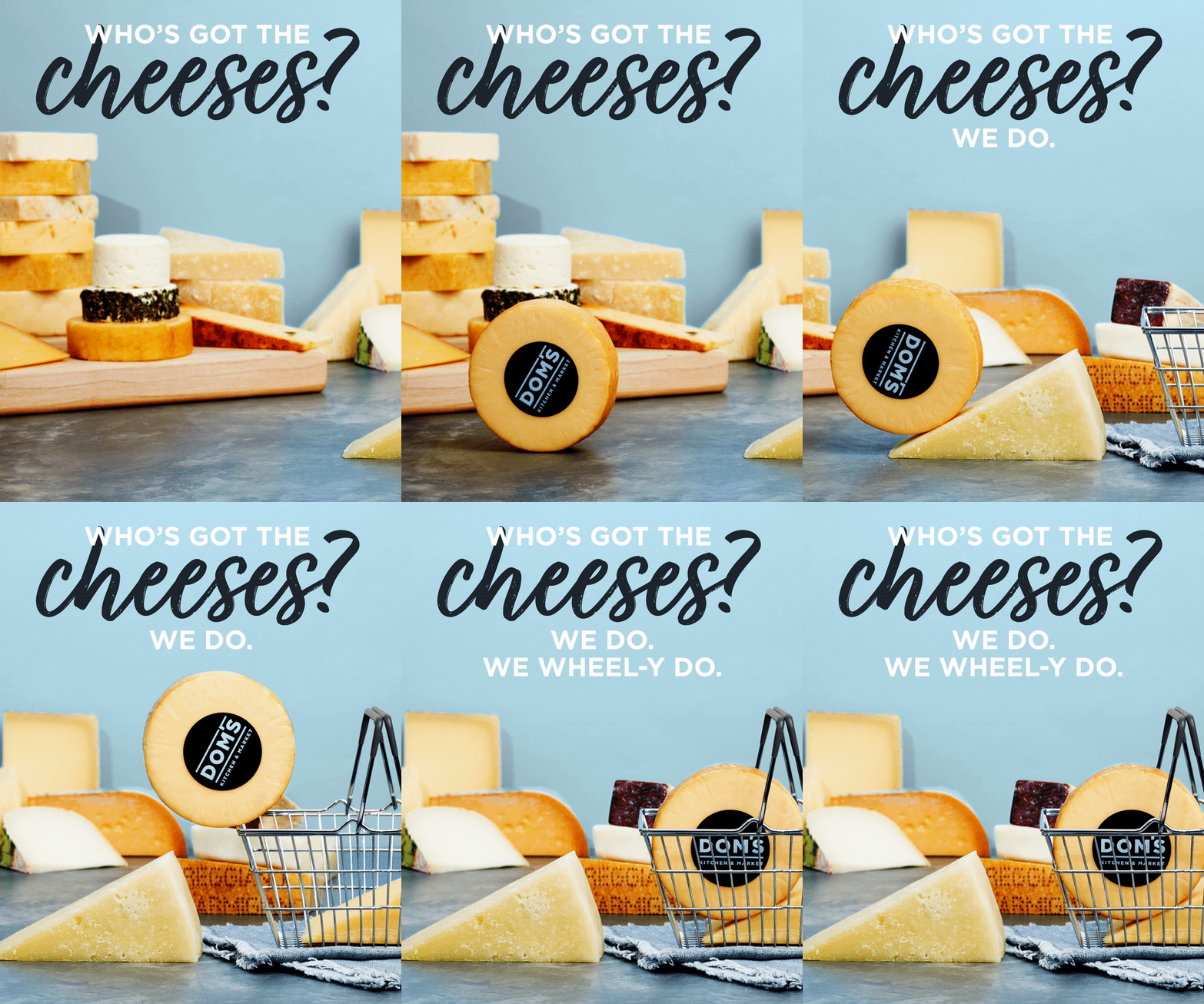
Concept: I can’t tell you how much they loved this. This was a case where account was kind of knocking it down but I had a feeling and to save it suggested “well why not keep it around as bonus content.” Sure enough, they ate it up.
My thinking behind it was pretty simple, and this is how I described it in meeting “what works in social is seeing something unusual - and how often have you see a wheel rolling around on social.” It’s unusual, fun, and playful.
A nice additional touch I included was to add the logo onto the wheel for some extra branding.
Post Copy: What’s your favorite cheese? With over 300 cheeses, when you roll into Dom’s you can be sure you’ll find it here.
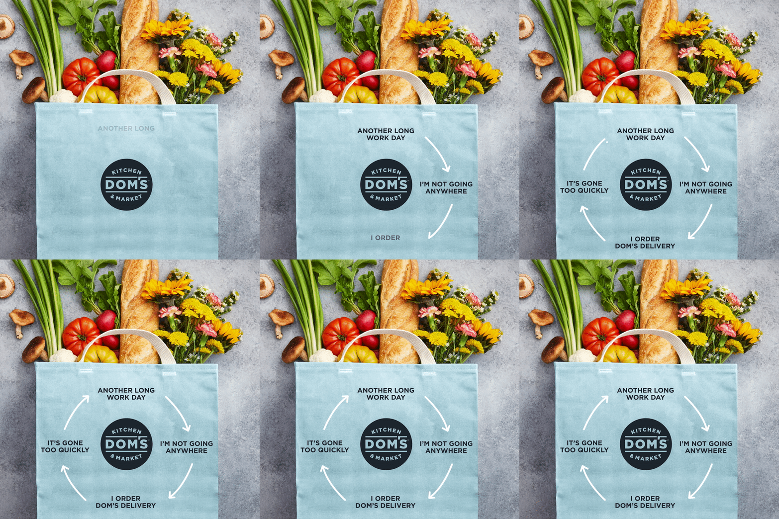
Paid social video: I inhereited this concept as just on a blank page and with very different language. To push the concept I took it off a blank frame and put it onto a bag (with the logo for added branding), and added the purchased items pouring out. I also made the language more relatable, consumer friendly, and even a push towards an understanding tone in the post copy.
Post Copy: As much as we love having guests, sometimes delivery just makes life easier. We get it, and we’ve got you covered.
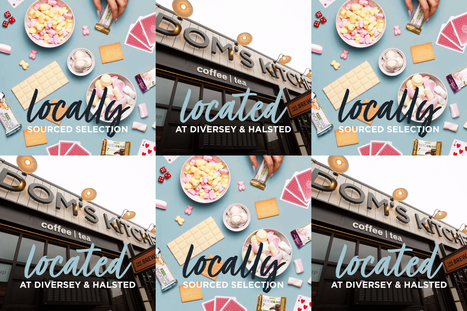
Billboard: With just four seconds to convey the idea, I wanted an approach that minimally maximized information. The elegance of the concept is the simplicity with which it relays our two key pieces of information: that Dom’s is a way to get products produced by the community, and that it’s nearby (these were targeted billboards buys near the store).
The “Locally” and “located” not only harmonize beautifully, they also reduce comprehension time for the viewer.
Paid social still: With spring in mind, I thought it’d be cool to do a spread indicate a sort of “one stop shop” factor to Dom’s. The “picnic planning” angle functions beautifully as a vehicle to show an offering portfolio.
What you can’t tell by just looking at the piece is that an additional layer is that a lot of the options shown are locally sourced and would be tagged in sharing, giving an extra touch with that “we’re local” cache.
Post Copy: Need to fill up your picnic basket? Look no further. We have foodie faves to make planning a day in the park a piece of cake.
Social: I thought it’d be cute to make a literal pie chart. In case the viewer missed the gag I mentioned it in the post copy. The on-image copy are all relatable and honest, a frankness from a brand that is both a bit unusual/unexpected and fun, guided to the a audience of women in their 30’s.
Post Copy: Which slice of our pie chart speaks to why you get groceries delivered?
TikTok: Part of the ask was for 6 “ASMR” videos for TikTok. I thought it might be nice and help greatly simplify production costs and make for compelling content if we produce a series of videos, telling stories in the same structure.
So I came up with a format, a sort of “meet the meal” series with each video focused on an offering from Dom’s (fresh bread, wine, oysters, etc). Each starts by introducing an actual team member, then a series of appetizing shots showcasing the “made right infant of you” appeal of the offering, ending with the final product.


